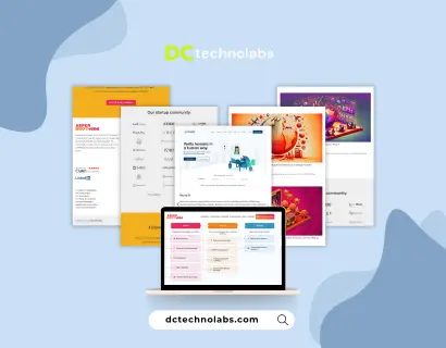
Responsive Web Design Agency Associative
Associative builds responsive websites that work everywhere on phones, tablets, laptops, and desktops. Whether you’re starting fresh or improving an old design, we deliver layouts that load fast, look clean, and help your users navigate with ease.
INDIA
7+ Years
50+ In House
Mobile-First Website Design Tablet & Desktop Optimization WordPress, Laravel & HTML Builds UI/UX Planning & Prototyping Speed & SEO Optimization Post-Launch Support & Edits Mobile-First Website Design Tablet & Desktop Optimization WordPress, Laravel & HTML Builds UI/UX Planning & Prototyping Speed & SEO Optimization Post-Launch Support & Edits Mobile-First Website Design Tablet & Desktop Optimization WordPress, Laravel & HTML Builds UI/UX Planning & Prototyping Speed & SEO Optimization Post-Launch Support & Edits
DC Technolabs Approach to Responsive Web Design
We begin by learning about your audience and how they browse then we plan layouts that adapt beautifully across screen sizes and devices.
Our designs focus on mobile-first performance ensuring every button, image, and section resizes properly and delivers a smooth experience.
We develop with HTML, CSS, WordPress, or Laravel coding clean structures that adjust to phones, tablets, and desktop monitors alike.
After launch, we help with layout tweaks, speed checks, mobile fixes, and any adjustments to keep your site responsive and effective.
Responsive Web Design Services at DC Technolabs
We create clean, mobile-friendly websites that resize perfectly on any device combining speed, structure, and style for a better user experience.
Mobile-First Website Design
We start every design with mobile in mind ensuring fast loading, thumb-friendly buttons, and clear content structure on small screens.
Tablet & Desktop Optimization
Your site will stretch, resize, and reflow based on screen size making it beautiful and functional across tablets, laptops, and desktops.
WordPress, Laravel & HTML Builds
We build responsive layouts with your preferred stack whether that’s a CMS, custom HTML, or a full Laravel web application framework.
UI/UX Planning & Prototyping
Before coding, we wireframe and prototype your design ensuring every element fits well and works fluidly on all screen sizes.
Speed & SEO Optimization
We compress images, optimize code, and structure content to boost your Google rankings and reduce bounce rate on mobile devices.
Post-Launch Support & Edits
Once live, we help improve responsiveness, fix layout bugs, adjust sections, and support content or device-specific enhancements.
Our Proven Responsive Web Design Strategy
Discovery & Goal Planning
We begin by understanding your website goals, user behavior, and content needs so we can shape a mobile-first design strategy from the start.
Goal Setting
We define what your website needs to do and who it serves.
Device Research
We explore what devices your visitors use and how they browse.
Content Priorities
We prioritize what matters most to your audience on small screens.
Wireframes & Layouts
We sketch out responsive wireframes to structure content showing how sections will shift and resize across mobile, tablet, and desktop.
Section Blocks
We plan clear sections for header, content, and footer.
Breakpoint Planning
We define layout behavior at mobile, tablet, and desktop views.
Feedback Round
You review and approve before we start visual design.
Visual Design & UI Styling
We create polished mockups in Figma or Adobe XD applying brand colors, typography, and interactive layout features for all devices.
Color & Font Selection
We apply your branding across every screen size.
Mobile Interaction
We ensure buttons, menus, and sliders are touch-friendly.
Cross-Screen Consistency
We match visual feel across small and large displays.
Development & Responsive Coding
We build your site using responsive HTML, CSS, and frameworks ensuring fast load speed, clean layout transitions, and solid performance.
Responsive Grid Setup
We use grid/flexbox systems that adapt per screen.
Mobile-First Coding
We develop for small screens first, then scale up.
QA as We Code
Each section is tested live across devices as it’s built.
Testing & Launch
We review every screen size and browser fine-tune layout bugs, optimize speed, and go live once everything looks perfect.
Device Testing
We preview your site on real mobile, tablet, and desktop.
Browser Compatibility
We test on Chrome, Safari, Firefox, and Edge.
Page Load Checks
We optimize images, scripts, and layout for fast speed.
Post-Launch Support
After launch, we stay on board helping you adjust for new devices, update layouts, fix issues, or add responsive sections as needed.
Quick Fixes
We correct layout bugs reported after launch.
Section Edits
We help revise or add new blocks as you grow.
Responsive Audits
We recheck device performance on a schedule.
Need a Site That Works on Every Device?
Awards & Achievements
for exceptional service
Projects We’ve Delivered for
Responsive Web Design
We’ve built responsive websites for tech startups, online stores, consultants, clinics, agencies, and service providers. Each project is designed with a mobile-first mindset optimized to look and perform great across all screens, without sacrificing speed or style.


MedGo
MedGo has completely transformed healthcare accessibility. It’s an easy online platform that allows patients to order prescriptions and essential medical supplies. With just a few taps, patients can have their medication requirements delivered to their doorstep. MedGo is your ultimate healthcare routine with utmost convenience.
We’ve 529+ Clients Feedback
Discover how our clients have benefited from our services through their own words.

The web application developed by your team has transformed our operations and increased efficiency. Excellent work!
Gideon Kipsang
Director
Thanks to your innovative eCommerce solutions, our online sales have doubled. Your team truly understands our needs.
Yogi Mull
CEO
The custom web application you developed has been pivotal in our data analysis. It’s both powerful and user-friendly.
Alex Taylor
Data Scientist
They've built eCommerce platform that is easy to use and has significantly boosted our customer engagement. Great job!
Amy Bivona
Sales Advisor
Their SEO & Marketing services have elevated our online presence, leading to more partnerships than ever before. Thanks to DC!
Tasha Nolen
Partnership Manager
Our new website is not only visually stunning but also incredibly functional, thanks to your talented design and development team.
Andrei Petyhov
Manager
With your SEO expertise, our website now ranks higher on search engines, and we’ve seen a notable increase in traffic.
Jake Wells
Founder
Your team delivered a website that perfectly captures our brand and values. The design and functionality are outstanding.
Georgina Woollams
Managing Director
The web application you created is a game-changer for us, enhancing our ability to coach and track client progress seamlessly.
Erich Schlenker
Business Coach
Your strategic approach to SEO and digital marketing has provided us with incredible visibility and growth. Thank you!
Leo Greenberg
CEOWhy Choose DC Technolabs for Responsive Web Design?
At DC Technolabs, we don’t just resize screens we build fluid, fast, and frictionless experiences for every device. With our design-first approach, coding skills, and attention to responsive behavior, we make sure your visitors always get the best view anywhere.
Designed over 150+ mobile-first websites
Built with responsive CSS, grid/flexbox, and frameworks
Tested on real devices, not just emulators
Clear pricing, fast delivery, and post-launch support

Frequently Asked Questions About
Responsive Web Design
Responsive design ensures your site looks and works properly on any screen mobile, tablet, or desktop without needing a separate version.
Yes. We can redesign your current website into a fully responsive layout while keeping your content and branding intact.
Absolutely. We optimize files, images, and code for fast mobile load times and smooth user experience.
We use HTML5, CSS3, Bootstrap, Tailwind, Blade, and CMS platforms like WordPress or Laravel depending on your needs.
Yes. We test across Android, iPhone, iPad, and desktop browsers to ensure real-world compatibility and experience.


